


Choices, Choices
Color choice in the home is highly subjective, and for that reason, it’s not the palette as much as the execution that matters. A well-appointed home distinguishes itself by the story it tells about its inhabitants. There are no wrong colors, but there is psychology at play. Warm colors like red, orange and yellow tend to elicit heightened mental activity like creativity, while cooler tones like blues and greens inspire calm; a room’s purpose should largely guide color selection.
Client-Centric Color
Most individuals don’t know where to begin in terms of adding color to their home. Oftentimes, I’ll ask clients if I can peek into their clothes closet. More often than not, I find clues there. Without realizing it, most people’s favorite colors are reflected in their wardrobes. When painting a client’s home or purchasing fabrics, I ask if they prefer blue to red, giving me the idea if they like warm or cool colors. From there, I break it down further, asking if they choose blue over green or red over yellow. After a few conversations, we can determine their favorite shades and I begin building a client-centric palette.
A Monochrome Moment
The key to successfully creating monochromatic rooms in vibrant shades is an all or nothing proposition. You need to be ready to fully commit to the adventure! A room best suited for showcasing such striking colors is a powder room, home bar, a vestibule, game room or library or any room in which you want to soulfully add drama and unexpectedness. However, your home will not feel thoughtfully designed if only one room is addressed in saturated colors, while neighboring spaces are ignored. For this reason, powder rooms are my favorite place to dazzle; it’s the one place most house guests will visit and a space whose aesthetic needn’t marry with adjacent rooms.
Room by Room
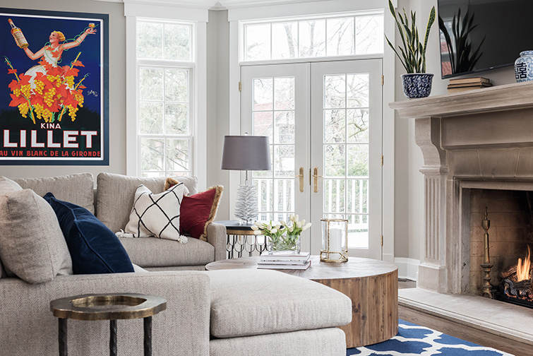
When using one dominating color scheme in a room such as a living room, it’s best to carry the theme into other rooms. This is not to say if you have a predominately blue color scheme that every room has to be blue. Simply pluck and apply the color with pillows, art or an accessory in the other spaces. A home’s rooms should harmonize while still having ultroneous moments.
Spring Flings
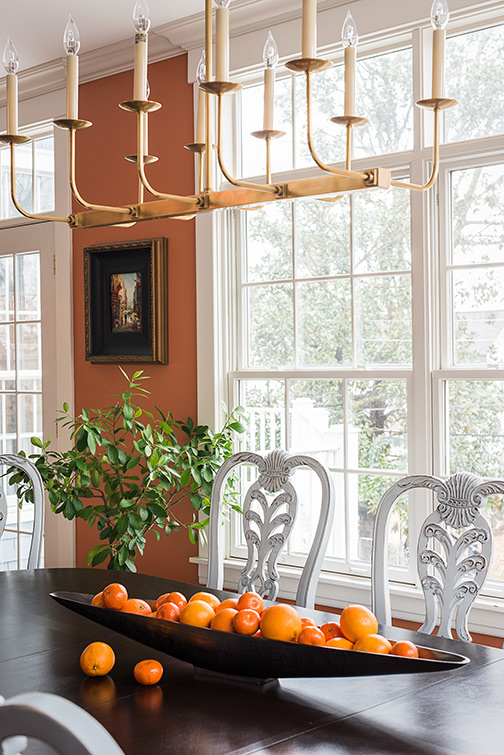
This spring we are seeing bright, cheerful colors popping up on everything from table wear to outdoor fabrics. We’ve taken last year’s terra cotta craze and gone a step further on the reddish tones. We are seeing more burnt orange, vermilion and vibrant corals than ever before—possibly as a nod to the '70s. Fabric lines are introducing it into upholstery and printed fabrics. The pandemic had a lot to do with the resurgence of bolder colors.; being homebound for that protracted period found homeowners craving excitement.
Color of the Year
Annually, Pantone teases us with The Color of the Year. This year’s color is Viva Magenta, a velvety cross between red and pink. It’s a lovely color, but I suggest using it judiciously. If you want to embolden your home with a this or another statement color, consider sprinkling it in with a vase, drinking glasses in the kitchen or towels in the powder room or guest bath—items that can easily be swapped out if you fall in love with next year’s comely siren.
Finding Favorites
When working with clients, I don’t have a favorite color or palette. I let the owner’s personality and personal taste guide my choices. I often suggest colors based on a muse; most folks have a family heirloom, a favorite rug or something sentimental they want to display. I try to find something within the composition that successfully captures the spirit of the individuals and build upon it. Often, people don’t recognize an item’s beauty and view it as simply something they feel obliged to keep. I nudge them to embrace it, and more often than not, it’s the most delightful moment in the home.
Seeking Rest
I recommend seeing your home as a sanctuary. Smart design is not about keeping up with trends or buying out an entire catalog of furniture. I encourage clients to take their time and enjoy the journey – collect art or bring back something special from travels, and let that be your inspiration.
Follow your heart and everything will fall into place.