
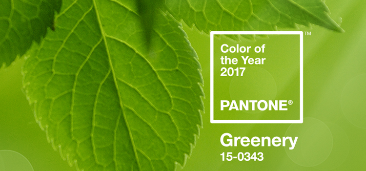
Greenery: a classic, chameleon-like color. Like a breath of fresh air, it gives new life to any room. Greenery has always been a staple in design, but this year, the color branched out into every corner of our homes, leafing no throw pillow unturned.

Nature’s neutral was chosen as the 2017 Pantone® Color of the Year because it “satisfies our growing desire to rejuvenate and revitalize,” says Leatrice Eiserman, Executive Director of the Pantone Color Institute. And isn’t that just what interior design is about — revitalizing our space, leaving us rejuvenated?
We often saw greenery used in design in conjunction with texture, another 2017 design trend. Green velvet had a big moment this year (think tufted sofas and armchairs). Visual texture, such as high-gloss furniture and accent walls, are other forms in which the color made a large-scale impact.
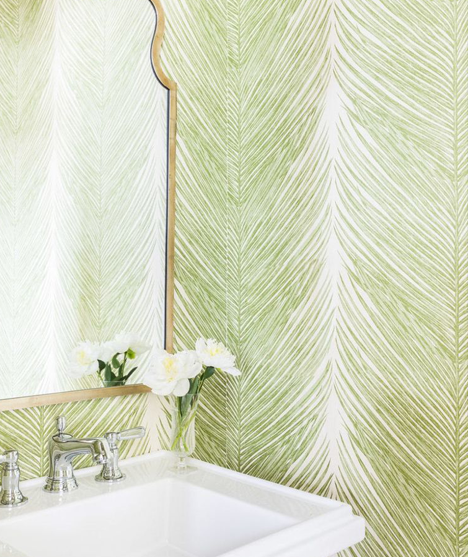
What about pre-designed rooms, where greenery was not a primary pigment? A complementary shade was easily added through curtains, art prints and throws. Front doors began donning the color. Appropriately, physical greenery popped up more indoors, in the way of palms, succulents and fiddle leaf figs.
Our thoughts as 2017 comes to a close? Greenery may soon be retired as the Pantone Color of the Year, but it won’t be retreating from interior design any time soon.
Still looking for ways to incorporate greenery in your home design? Read our SLHL Trends: Greening Up article from April's Color Issue!


No comments