
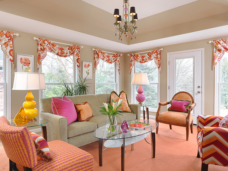


“When people walk into the room, I see them glance around and smile, and they say it’s really a happy room. And, it is,” says homeowner Nanette Stevenson. Manche has done nearly every room in the Stevensons' house, and the homeowners have followed even his boldest ideas. “Tom is very creative, and I trust him — a lot,” Nanette adds. When Manche decided Tarkay paintings from a nearby living room would set the newly built family room’s palette, he knew bright fuchsia and orange hues wouldn’t be an issue.
Nanette’s verbal cue was that she wanted a “happy, comfortable space.” Vibrant color took care of that first element, and furniture would address the latter, with a neutral, inviting sofa and chairs snagged from the Refind Room – one of Manche’s favorite local spots – and recovered in eye-catching arrow and swirl patterns that could rest casually atop an orange carpet from Allen Interior Furnishings. It’s that stunning base, Manche says, that draws everything together.
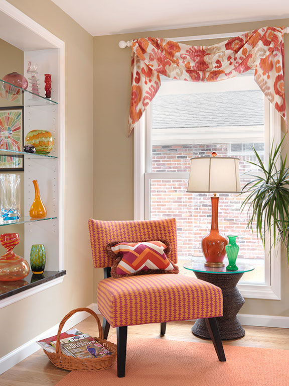
Rear windows open to an idyllic scene and natural light. Manche didn’t dare compromise any of that — rather, he played up the landscape as another piece of art complementing simple, contemporary floral prints hung on taupe walls. The windows, he says, “Just needed to be redressed on top.” Did you notice those window treatments add an element of traditional style? That’s another one of those details that take the space from finished to refined.
Throw pillows resume the basic palette, while yellow and paler pink lamps from Brody’s add pops of colors atop end tables. “Very seldom do I use a shade that comes with the lamp. There’s always something better you can put on there,” Manche says. For this space, he chose white, though he’ll often add sophistication with a black shade. You’ll notice that touch up high, on a chandelier from Prints Charming that wows, despite its petite size. The whimsical lamp, in fact, is Nanette’s favorite part of the room.
The family room was an addition, and the original exterior windows needed to be removed, of course. The architect’s idea was to fill those gaps with floor-to-ceiling glass. “What a waste,” Manche says. He had the idea of building two open bookcases and filling them with beautiful trinkets that would be seen from not just the family room, but the connected dining room, too. When he got the go-ahead, Manche says he “went out and bought all new glass vases. It’s breathtaking, and just so unexpected with purples and pinks and greens and blues.”
When it comes to adding color to a space, Manche clearly has a few secrets up his sleeve. “I always suggest we use three colors in any space, and in public spaces,” Manche adds, “I suggest you use those same colors throughout because it pulls everything together.” Minimalists can shy away from color. But, Manche says, you’d be surprised: Color can be every bit as modern as variances of white.
Resources
Designer: Tom Manche Interiors, 314-993-2700
The Refind Room, 314-962-7666
Allen Interiors, 314-961-4111
Brody's Lamps, 314-647-3318
Prints Charming, 314-721-2699