
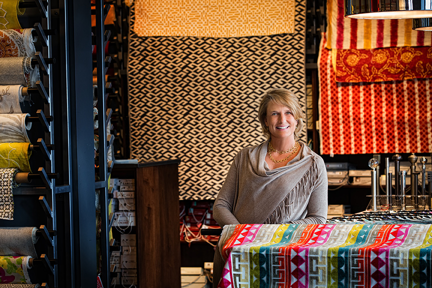

The right blend of color, texture and pattern in fabrics and wallpaper can create a stunning scheme. LuLu Belles Fabrics is stocked with thousands of yards of the most current fabrics and trims to help pull together the right looks for your home. Punch up a room with the perfect pillow, drapery, bedding or furniture fabric.
SLHL: I'm color shy, how can I subtly add color through fabric without going overboard?
Mary Beth: When attempting to add subtle color to a space, I like to use an 80/20 rule: 80 percent neutrals and 20 percent color. The color can be added through less-permanent features like accent pillows, throws or even draperies, so you're not married to a certain color or pattern if you tire of it or decide you don't like it down the road.
SLHL: How many different colors can I use in a space?
Mary Beth: There's really no official limit to the amount of colors you can use in a space, but generally you should aim to have one or two primary colors and a handful of secondary colors evenly spread around the room. All in all, you'll know if you have too many colors because the space will probably feel chaotic and disorganized.
SLHL: Are there guidelines to mixing patterns in your fabrics?
Mary Beth: Mixing patterns is such a fun look right now, but it can be a little tricky to get it right. It's usually a good idea to have a mix of organic and geometric patterns and a variety of large and small-scale patterns. In the end, if you stick to a very specific color scheme within your patterns, you're likely to be more successful and have a unified finished product.
SLHL: How do you go about pairing a bold wallpaper/fabric pattern with color in a room?
Mary Beth: If you have a bold fabric or wallpaper that is prominent in the space, try using more subtle colors or neutrals elsewhere in the room. Make sure to add accents that incorporate the bold textile colors to unify the space, though!
SLHL: What is a good wallpaper color to use in a kitchen?
Mary Beth: I've always liked the color blue in kitchens, but it's really up to personal preference. Neutrals can also look very stunning against the natural materials of your counters and cabinets.
SLHL: Is there any time when you can mix geometric prints with floral prints?
Mary Beth: Yes, especially if it is a more modern floral and they have the same color scheme.
SLHL: Brass and gold accent tones are back. Do these metal tones affect your color choices in fabrics or wallpaper?
Mary Beth: They definitely play a role because the gold-colored metals tend to be a little warmer whereas a chrome or silver metal would be on the cooler side. You may want to select warm-toned fabrics and wallpaper. It's not an exact science, though. I've seen some beautiful spaces that mix metals and cool- and warm-toned fabric.